I‘VE LONG BEEN a pursuer of the decorative style designated in the 1960s by the phrase Art Deco. Perhaps it’s best to begin this little piece of mine with something by way of definition. So: art deco is a visual style created in Paris in the 1920s and characterized by simple, linear and geometrical forms. This aesthetic was popularized at the 1925 International Exhibition of Modern Decorative and Industrial Arts, held in Paris between the months April and October.
Art deco spread rapidly and had a particular influence on the architecture of Philadelphia, Buffalo, New York, and above all Chicago. Buffalo City Hall is a good example of art deco with which I was well familiar in my youth, having visited the building on a number of occasions. (I can tell you, for instance, it is a far less impressive building on the inside than it is on the outside.) The Paris exhibition transformed everything from cuff links and cigarette cases to the grills of automobiles and the skylines of cities. Bold, angular, and assertive visual lines replaced the more fanciful and ornate look of late Victorian and Edwardian art nouveau. I’m also keen on this other aesthetic as well, and as it happens I’ve just returned from the shop which I’ve contracted to frame a set of embossed art nouveau greeting cards based on the glazed clay majolica tiles which were produced around 1890-1910.
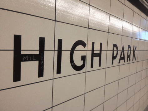
Art deco is at the top of the design pile, in my opinion. It is no mere coincidence that my favourite American cities, New York and Chicago, remain much under its influence. Elsewhere I’ve mentioned the pleasure I get from the art deco font of the Toronto subway. (A geometric sans-serif based upon Futura, Toronto Subway is the font’s name.) Below is a photo I took of the station near my house. Other art deco fonts of note are Erbar, Kabel and Futura — all of them fine “Gothic,” or sans-serif, fonts. There are many other examples of art deco influences, and in the most unexpected places. Only this morning, for example, I noticed the distinctly art deco font (notice the A especially) in the logo of my stove, a photo of which I attach. Art, and more specific art deco, is everywhere.
Most know art deco from the work of prominent designers such as Romain de Tirtoff, who assumed the name “Erté,” derived from the French pronunciation of his initials (RT). Looking over the work of Erté and his contemporaries, I’ve sometimes allowed myself to think how much better it would have been to have lived through the 1920s — but of course this notion is complete nonsense, as the recent Woody Allen movie Midnight in Paris has laboured to show. All the same, art deco conveys glamour, optimism and bottomless confidence, and these are for me an irresistible combination. Never mind that during art deco’s reign, roughly from 1925 to 1945, the world collapsed not only once but twice.
It’s better then to enjoy art deco from afar, and it occurs to me in this connection that I’ve put a good deal of the stuff in my physical environment. The building in which I live is a late example, and features many art deco flourishes such as sunrise motifs and fantails. One is never far from art deco in a large city, and so my own neighbourhood features many fine buildings from the ’20 to ’40s. Then there are period objects about me such as watches and pens, which never fail to give me pleasure every time I see them. Art deco is at its core a paradox, an aesthetic of boundless modernist grandeur forged from the simplest of elements. Nor did it go away entirely at the war’s end, elements of art deco persisting well into the 1960s and the space age.
Above: An Eversharp “Fifth Avenue” fountain pen, circa 1944. By this time, art deco was in decline. The pen, as a consequence, sold poorly.


